My latest Making Memories blog assignment was to use this photo ad as inspiration for a layout:
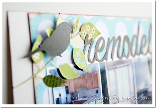
Here's a little peek (or two) at the layout I created:
You can see the entire layout and read about how I was inspired by the ad by visiting the Making Memories blog today. :)
Patterned Paper (I cut the vine from this sheet) (this is the background)
and tons of these foam squares (behind almost every single hand-cut leaf)


This is so beautiful! I'm amazed at your patience to cut out the branch, and it looks fantastic pop-dotted up like that.
ReplyDeleteWendy - your page is absolutely beautiful!!!!
ReplyDeleteGorgeous! Thanks for sharing. I often see magazine pics and think "this would be an awesome page design' but can never put it on paper! Wonderful job.
ReplyDeleteit looks fantastic
ReplyDeletedata entry work from home