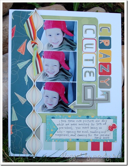
I sure do love this little guy - he makes me smile every single day.
He is super sweet and sensitive and smart and crazy cute!
This layout was published in the January 2010 issue of Creating Keepsakes Magazine. I made it shortly after The Boyfriend line was released by Cosmo Cricket. I loved it then - and it's still one of my favorites!
I thought I'd share a fun little trick I used to create the title.
The "CRAZY" portion of the title came directly from this sticker sheet:
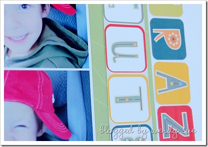
I wanted to add the word "CUTE" and I wanted it to coordinate with the "CRAZY." So...I used my scissors to cut the background of the sticker sheet - removing the entire piece around the empty "CRAZY" squares. There is a slight border around these stickers. I only needed four spaces for the word "CUTE," so I cut one piece off and I was left with four "frames." I placed these on the layout where I wanted to add the word "CUTE."
Next, I took the alphabet rub-ons that coordinate with this line:
And I added the gray letters within the sticker frames.
I love that there are so many coordinating elements to every Cosmo Cricket line - it makes it easy and fun to create pieces to use along with the cute existing elements.
Of course, I also had to add hand-written journaling with my favorite pen...and you knew there had to be machine stitching somewhere, right?


What an awesome Idea! Thanks for sharing it, I never thought of using the shadows before. I will be trying that one!
ReplyDeleteSuper cute! (and for the record, I voted for your cover....)
ReplyDeleteWhat an adorable page! love it!!
ReplyDeleteSuper cute!
ReplyDeletedata entry work from home