I'm just curious...which do you prefer?
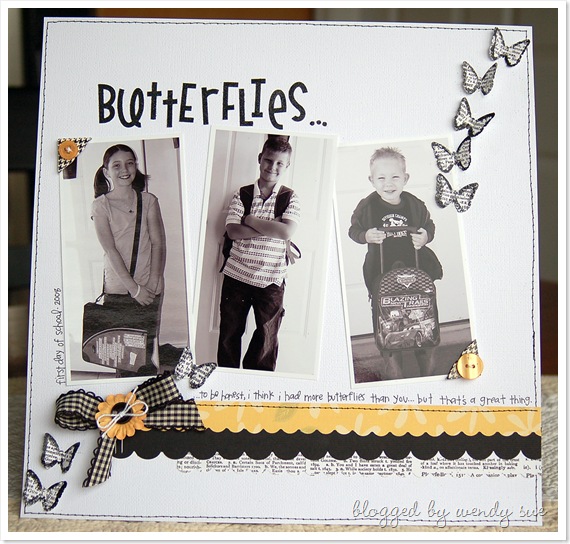
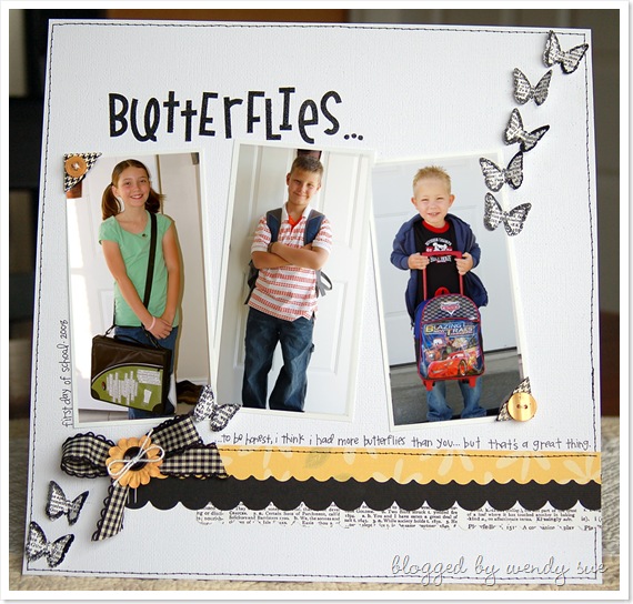
Here's a layout - one version with black & white photos and one with color photos.
One of these versions was published in the September '09 issue of Creating Keepsakes Magazine - the color version. I originally made the B&W version, but they asked me to switch the photos to color...of course, I was happy to do it.
I definitely have a favorite, but I would love to hear your opinion...
[ETA: I used a Martha Stewart Butterfly punch - you can buy them here. I also used black ZING to emboss the edges - you can buy it here and here. The super cute black glitter letter stickers are here and here.]


The one with the color pictures pops for me. I think there both great. :^)
ReplyDeleteI like the one with the color photos better too. Great layout and love how you did the butterflies!
ReplyDeleteI really love them both, but the color ones show off the beautiful color of their eyes! Noce job.
ReplyDeleteI'm voting for color - more IRL.
ReplyDeleteI like the colored photos. Which is funny-I LOVE B&W! But because the page is very simple colorwise, I think the color photos just pop and stand out more. LOVE your butterflies. Went and bought a butterfly punch just yesterday (50%off coupon!) after seeing that layout earlier!
ReplyDeleteWhen I first saw your title, I thought for sure I'd pick the color one. But after looking at them both, I prefer the black and white one. I like just the little burst of color with the yellow ribbon at the bottom. I'm surprised with the overwhelming response in favor of the color!
ReplyDeleteI like the color photo one! The lo is really cute!
ReplyDeletethe color photos all the way :)
ReplyDeletei'm in the minority here. lol! i love the black and white photos on this layout.
ReplyDeleteDefinitely the black and white - so beautiful - I know colour photos are great but the tones of the B&W layout are amazing. I might have to 'borrow' the colour scheme!
ReplyDeleteI like them both but the colour one shows off the children better and that why it is my choice.
ReplyDeleteWith the yellow and black I much prefer the black and white photos. Very nice layout BTW.
ReplyDeletecolor pics definitely!
ReplyDeleteI like the color one!! hope all is well!!
ReplyDeleteThe one in color is my favorite.
ReplyDeleteWow! How cute! I would lean towards the color pics, but both are really great!
ReplyDeleteThe color photo is my fave, the page doesn't have a lot of color other than the ribbon so adding the colored photo just seems to balance out the whole design.
ReplyDeleteI love black and white pictures. They are timeless, but on this page I think the color pictures really stand out. Love the glitter butterflies!
ReplyDeleteI love both but, I my eye seems to really love the color one!
ReplyDeleteFabulous layout BTW.
I like them both...I have to add that I love the idea of embossing the butterfly edges! what a way to make them stand out!
ReplyDeleteI think they both are great but my eye was drawn to the one with the color photo's.
ReplyDeleteI think they're both great but I think the color pics make them stand out more.
ReplyDeleteSurprisingly, I say the color photos, though I love black and white ones. For me, it just makes the children be the stars of the page.
ReplyDeleteI like the color photos as well. I love black and white photos, but with the layout as it is, they seem to fade into the background, not enough contrast.
ReplyDeletei like the color photos- only because your layout is more in black & white- (if you were to have more color in the layout- i would go with the B&W then!!)
ReplyDeletecolor photos...
ReplyDeleteadore this layout, i actually prefer the colour, which is odd as i am a B&W fan!!
ReplyDeleteHugs
anna x