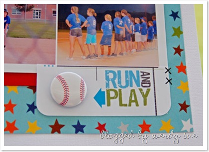
better, no?
In addition to nixing the blue background and replacing it with white cardstock (my favorite textured white cardstock by American Crafts), I took off the blue rick-rack and replaced it with teal ribbon. I also added a teal bow and an additional piece of flair - rah! rah! rah!


this was cute before ... but i do love this version more! i'm a white background kind of girl too ... and can't seem to get away from it. might as well embrace it, right? lol! and that flair is adorable!
ReplyDeleteI have to admit, I like this one better! I'm so impressed that you changed it- because even when I do pages I don't love- the fact that it's DONE- well, I have to move on! Ha!
ReplyDeleteGreat job! :)